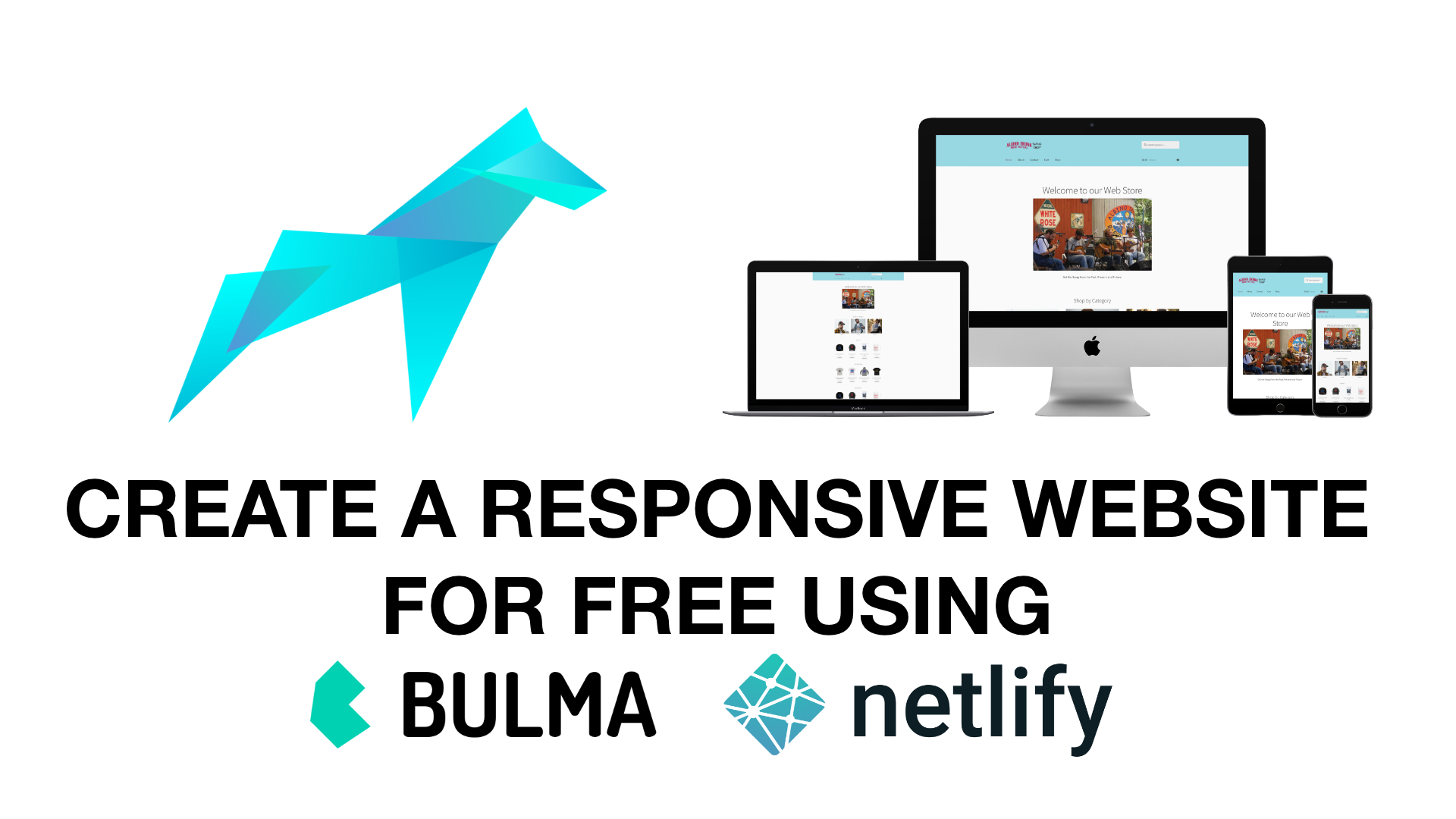
Using Bulma and Netlify to create and deploy a simple static website for Free
If you need to create a beautiful and Full Responsive website where you want to post some articles or promote your online/offline services, you come to the right place and that’s because we all know how crucial it is to get your business to the next level by being present online.
In this post we are going to learn how to create a simple static website using Bulma and deploy it to Netlify.
What do we want from a static website? To be simple, fast and practical! Now that we’ve settled these basic requirements let’s jump into and start working on it.
For design, structure and responsiveness of the website we are going to use Bulma’s classes to save a lot of time by not writing the CSS code. But, how’s Bulma going to help us do that? You’ll be surprised how easy and fun it can be!
Let’s start building your website! For this I am going to create a simple website just to show you all the steps to have your website alive.
The project: First Website
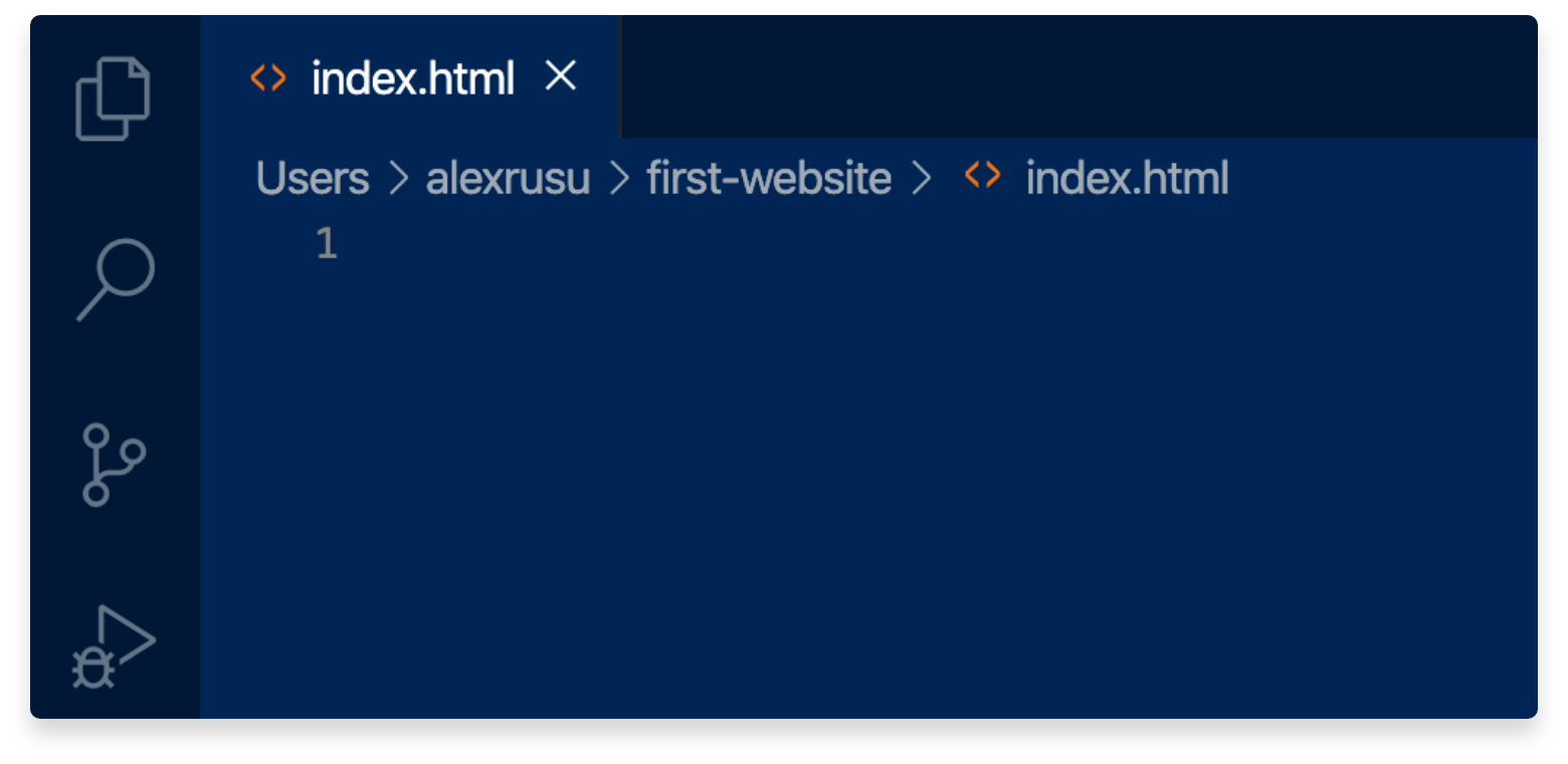
We’re going to create an folder where inside we will have all the files related to the website. Let’s name it: first-website. You can name it however you want.
Inside the folder we create an index.html file where we are going to build the website.
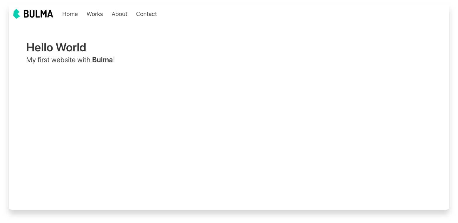
Now let’s go on Bulma to get the starter template where is included everything we need to start. It should look like this.
<!DOCTYPE html>
<html>
  <head>
    <meta charset="utf-8">
    <meta name="viewport" content="width=device-width, initial-scale=1">
    <title>Hello Bulma!</title>
    <link rel="stylesheet" href="https://cdn.jsdelivr.net/npm/bulma@0.9.0/css/bulma.min.css">
  </head>
  <body>
  <section class="section">
    <div class="container">
      <h1 class="title">
        Hello World
      </h1>
      <p class="subtitle">
        My first website with <strong>Bulma</strong>!
      </p>
    </div>
  </section>
  </body>
</html>
Let’s copy this and paste it to our index.html file.
Open the index.html file with a broswer such Chrome, Safari, Opera, Mozilla and you’ll see your website alive, but for now its just locally. How nice is that, right?
Now we need to start add sections like Navbar, Content, Contact, Footer etc.
For that we’re going to use Bulma’s components, classes and elements from here. Take your time to analize and read all about Bulma!
1. Navbar
The navbar code we’re going to take it from Navbar. It will look similar to this one. Add this code between the start tag <body> and close tag </body> in index.html
<nav class="navbar" role="navigation" aria-label="main navigation">
<div class="navbar-brand">
<a class="navbar-item ml-5" href="https://dutylabs.ro">
<img src="imgs/logo-dutylabs.png" class="image">
</a>
<a role="button" class="navbar-burger burger" aria-label="menu" aria-expanded="false"
data-target="navbarBasicExample">
<span aria-hidden="true"></span>
<span aria-hidden="true"></span>
<span aria-hidden="true"></span>
</a>
</div>
<div id="navbarBasicExample" class="navbar-menu">
<div class="navbar-end mr-5">
<a class="navbar-item">
Home
</a>
<a class="navbar-item">
Works
</a>
<a class="navbar-item">
About
</a>
<a class="navbar-item">
Contact
</a>
</div>
</div>
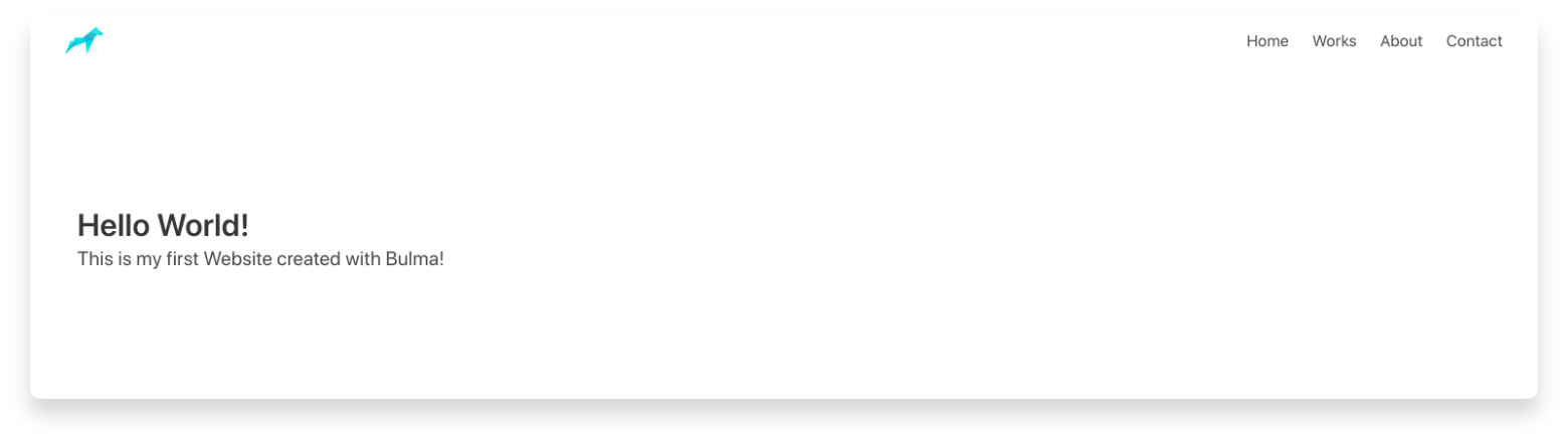
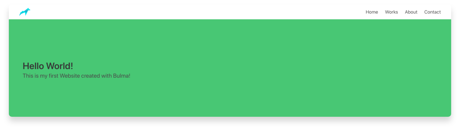
</nav>Now your website should look something like this. As you notice, I changed the navbar. I deleted the More dropdown button and I added the most used menu sections you may find on websites: HOME, WORKS, ABOUT, CONTACT. Here you can put whatever you want. It’s up to you!
Let’s say we don’t like that the Menu starts right next to the logo and we want it to be on the left side of the website. How we do that without having to write CSS code? The answer is very simple. We are going to use Bulma’s classes to set the Menu to the left part.
Go to the index.html and change this class
<div class="navbar-start"> into this
<div class="navbar-end"> Now you should see your Navbar items aligned on the right side.
2. Content
By example, I added the Hero section to welcome my visitors and let them know what it is about my website.
By default the Hero Section template it comes with white background and I want to change it. To do that, I went to this line
<section class="hero">and I added this CSS class
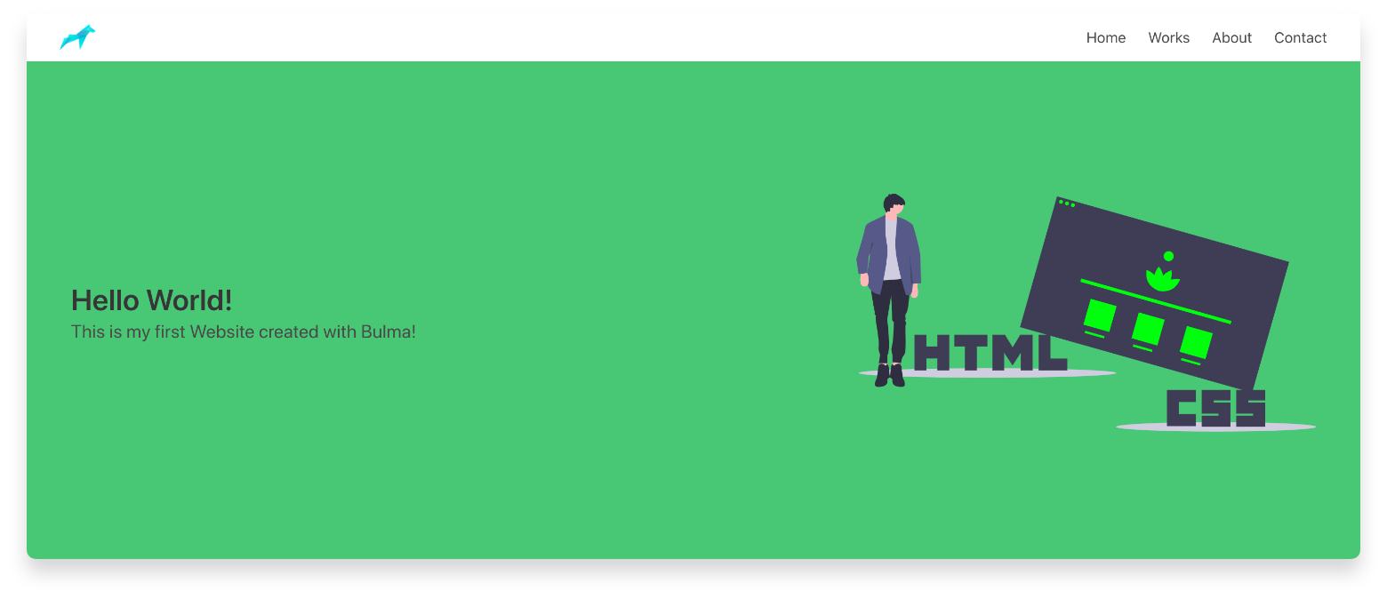
<section class="hero has-background-success">And it turned out like this.
That’s great! So easy to use Bulma classes to build up a website. Isn’t it?
I want to add an illustration on the right side of the page because I don’t like the empty space from there. For that I am going to use illustrations from unDraw. They are Free to use.
If you just go to add an tag, the picture will be under the text and we don’t want that.
Before adding the image we have to split the Hero section in 2 columns. For that we’re going to use the power of Level
Now, it looks like this.
3. Contact
We’ve learned how to add content on the website, let’s create another section where it goes the contact form so people can send you an email asking for more info about your services. It’s very useful to have it on the website.
I took the code from here Bulma Form Mine is a bit modified and simplier.
<form>
<div class="field">
<label class="label has-text-primary-light">Name</label>
<div class="control">
<input class="input" placeholder="Your Name">
</div>
</div>
<div class="field">
<label class="label has-text-primary-light">Email</label>
<div class="control has-icons-right">
<input class="input" placeholder="Email input" placeholder="example@domain.com">
<span class="icon">
<i class="fas fa-envelope"></i>
</span>
<span class="icon is-small is-right">
<i class="fas fa-exclamation-triangle"></i>
</span>
</div>
</div>
<div class="field">
<label class="label has-text-primary-light">Message</label>
<div class="control">
<input class="textarea" type="text" name="message" placeholder="Your Message"></textarea>
</div>
</div>
<div class="field is-grouped">
<div class="control">
<input class="button is-link is-info" value="Send"></input>
</div>
</div>
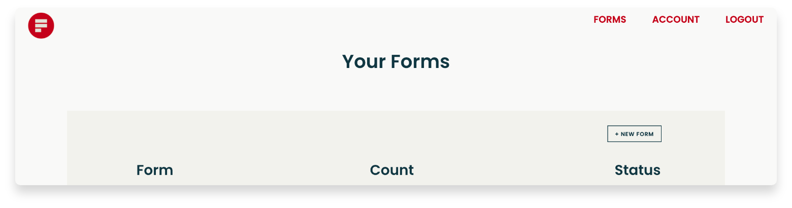
</form>Great! Now that we added a contact form, we need to make one more important thing. Connect it to formspree.io so we can get the emails. To do that we need to Sign Up on Formspree.io
Now that you’re logged in, let’s add a New form
Here you fill it with your info and click Create Form
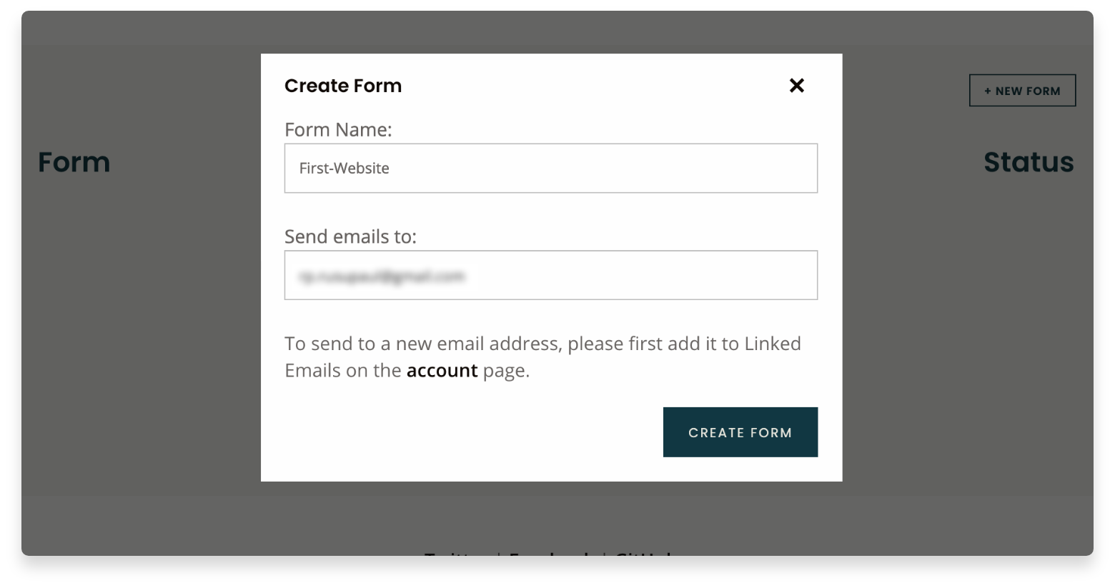
You should see your custom address that you need to add it in your code.
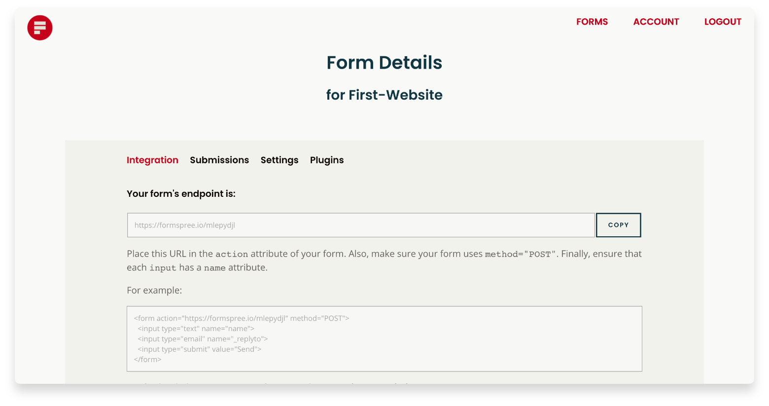
To do that, follow this:
Add to the form line this following
<form action="here goes your link from Formspree" method="POST">After that add this to each input tag: Name, Email and Message
<input type="text" name="name"></input>
<input type="email" name="_replyto"><input>
<input type="text" name="message"><input>
<input type="submit" value="Send"><input>
Now go back to your website and fill a contact form to check if everything works well. You should get an email from Formspree to your email that you signed up with.
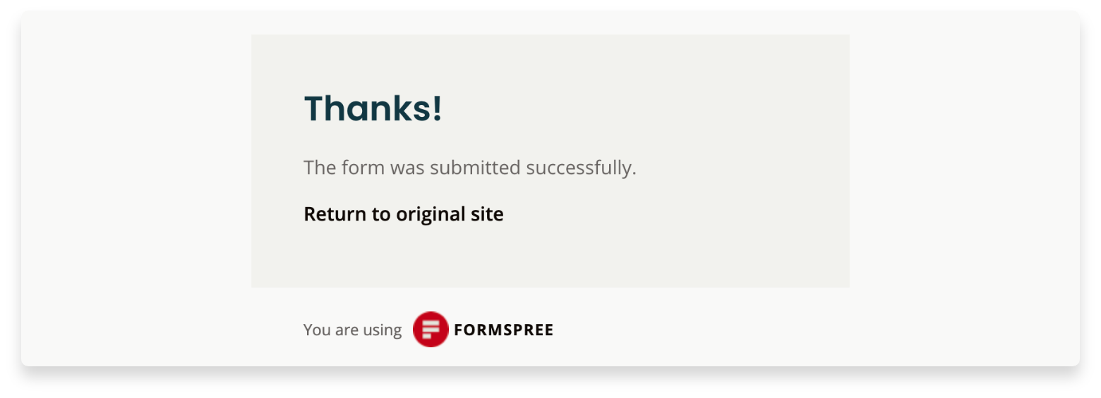
Congratulations! You’ve sent your first email test from your website! How amazing is that?!
4. Footer
On the Layout section, from Bulma’s website, we have a Footer template to start. This is a simple responsive footer which can include anything: lists, headings, columns, icons, buttons, etc.
  <footer class="footer">
    <div class="content has-text-centered">
      <p>
        <strong>Bulma</strong> by <a href="https://dutylabs.ro">Duty Labs</a>. The source code is licensed
        <a href="#">DutyLabs</a>. The website content
        is licensed <a href="#">CC BY Alex Rusu</a>.
      </p>
    </div>
  </footer>
Push to GitHub
Now it’s time to upload the project and make it available on GitHub so that Netlify knows where your website code lives.
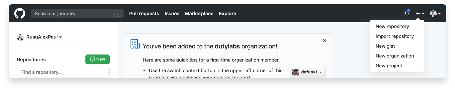
Sign up to GitHub
If you don’t have an account, please create yours now. Sign up on GitHub.
Create the repo
Next step is to create a new repository:
Push your code
Write this in your terminal inside your project directory.
$ git init
$ git remote add origin https://github.com/<your-username>/<repo-name>.git
$ git push -u origin master
Deploy to Netlify
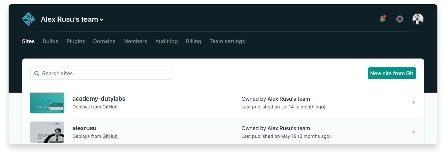
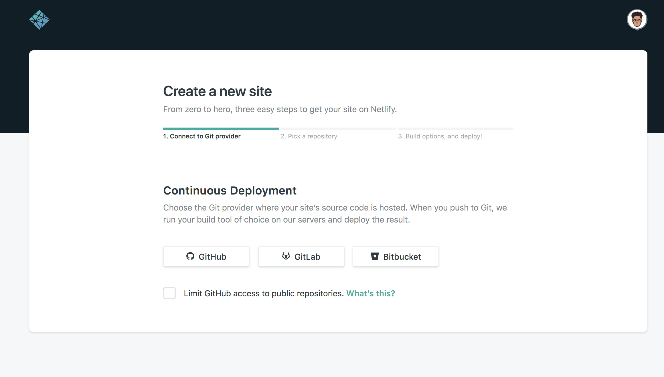
We’re almost done. Now we have to deploy it on Netlify. We’re going to use Netlify. Don’t worry, it’s Free!
First, create your account on Netlify Sign up on their platform.
Step 1
Once you’re logged in, go to your Netlify dashboar and create a new site from Git.
Step 2
Choose GitHub from the list and choose the name of your repository that you just pushed on GitHub.
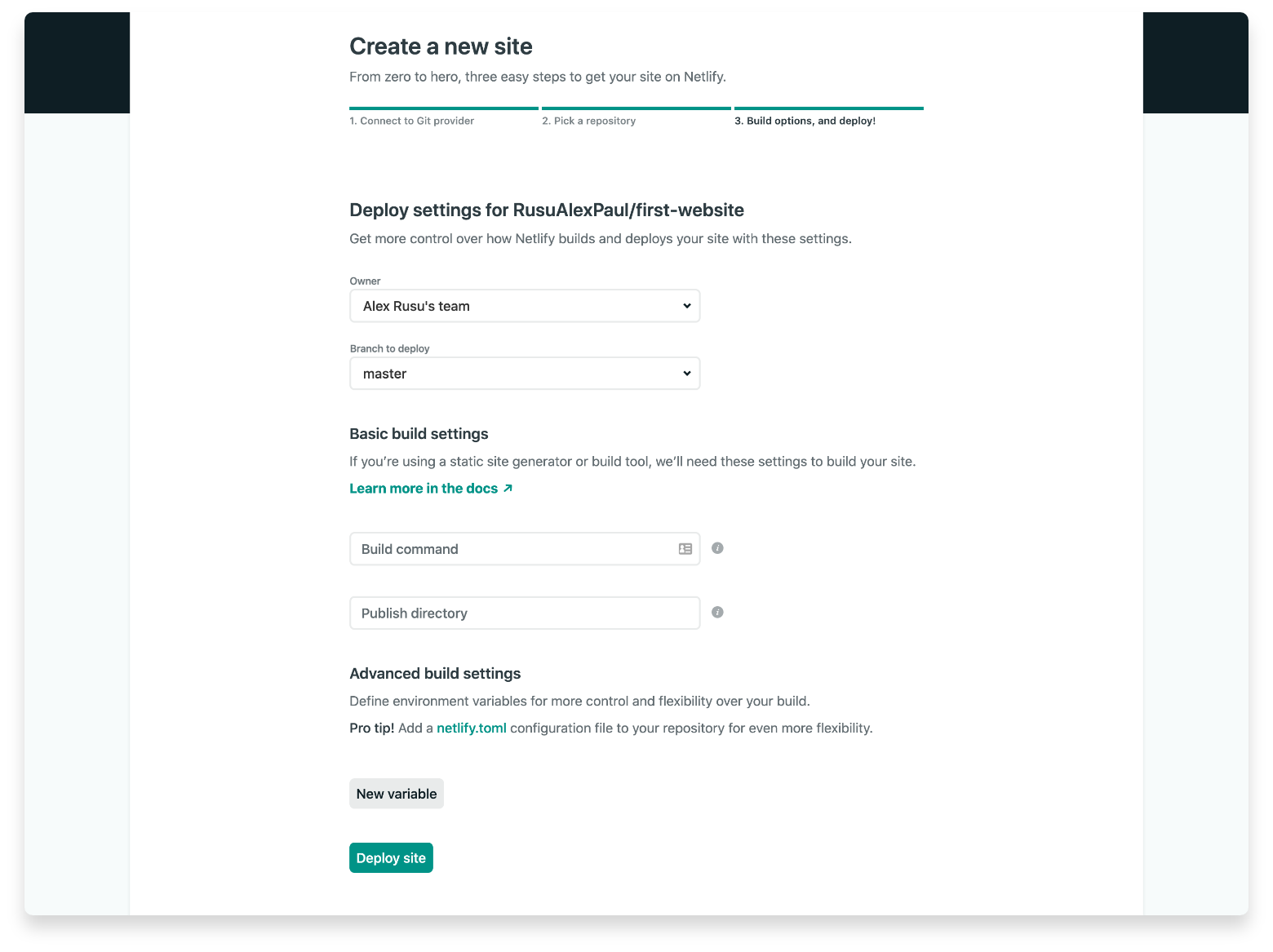
Step 3
Now that you connected the GitHub repository with Netlify, click on Deploy Site.
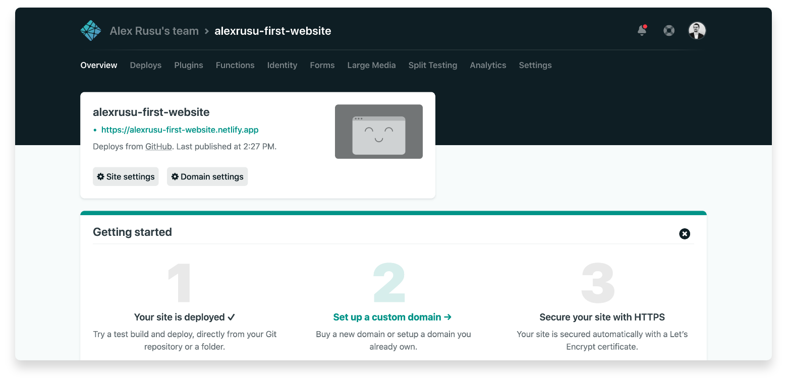
Step 4
In few seconds, you should have a subdomain created by default on Netlify. You can go and change it by clicking on Domain Settings. After that click on Add custom domain, where you can introduce your preferential domain name. That’s it!
Now enjoy your website and share it with your friends!
Here you find the project that I’ve showed you above by example, First-Website
I hope it helped you this article and if you find it useful, feel free to share it! We will appreciate a lot. Happy coding!